Canvas
#030303--fxr-color-bg-canvasPage background
Product design-system foundation
01 · Foundations
The approved foundation maps near-black values to named surface roles. Electric Blue is reserved for deliberately selected primary actions.
#030303--fxr-color-bg-canvasPage background
#080808--fxr-color-bg-navigationGlobal chrome
#131315--fxr-color-bg-cardDefault borderless card
#0C0C0D--fxr-color-bg-card-secondaryNested and supporting cards
#171719--fxr-color-bg-surface-raisedControls and popovers
#202123--fxr-color-bg-surface-strongSelected and inset states
#F6F6F6--fxr-color-text-primaryHeadings and essential copy
#030303--fxr-color-text-on-inverseLabels and essential text on white or light surfaces
#8A8C91--fxr-color-text-secondaryBody and supporting copy
#8A8C91--fxr-color-text-tertiaryReadable tertiary text and metadata
#61646A--fxr-color-text-disabledDisabled text and decorative marks only
#0260FD--fxr-color-action-primaryPrimary actions and selection
#0250D3--fxr-color-action-primary-hoverPrimary hover
#01307F--fxr-color-action-primary-pressedPrimary pressed
#5695FE--fxr-color-text-brandLinks and brand emphasis
02 · Typography · Internal review
Global heading sizes remain unchanged. The internal heading sample still tests a mobile step, while approved body roles and article-prose mappings are shown only here. Public Playbooks articles and checkout remain unchanged.
Scale logic
The desktop sizes are 18, 22, 26, 32, 40, 48, and 55px. The lower six steps follow a tempered progression, while display-xl preserves the tested /pricing hero treatment. Mobile compresses the upper steps more strongly while preserving separation between adjacent steps.
Breakpoints
Mobile is below 768px. Tablet is 768–1279px. Desktop starts at 1280px. Only the internal heading sample adds 1px on mobile. Approved Product body roles use their fixed breakpoint sizes without changing public pages.
Contract
Semantic defaults apply automatically. A visual override changes only the step, for example <h2 class="heading-md">. Never change the tag to get a different size.
Metallic rule
text-metallic comes first and the font-size token comes second. H3 through H6, body copy, eyebrows, and CTA labels never use metallic text.
Approved baseline + internal mobile heading test
Below 768px, the samples and Mobile column test 1px above each approved size. Tablet and desktop still use the approved scale; no global type tokens changed.
| Step | Default | Mobile proposal | Tablet | Desktop |
|---|---|---|---|---|
display-xl | Explicit hero variant | 32.5px / 1.04 / 700 / -0.03em | 42px / 1.04 / 700 / -0.03em | 55px / 1.04 / 700 / -0.03em |
display-lg | h1 | 37px / 1.08 / 700 / -0.03em | 44px / 1.05 / 700 / -0.035em | 48px / 1.04 / 700 / -0.04em |
heading-xl | h2 | 26px / 1.12 / 700 / -0.025em | 31px / 1.10 / 700 / -0.03em | 40px / 1.08 / 700 / -0.035em |
heading-lg | h3 | 27px / 1.16 / 700 / -0.02em | 30px / 1.14 / 700 / -0.025em | 32px / 1.12 / 700 / -0.03em |
heading-md | h4 | 22px / 1.22 / 700 / -0.01em | 24.5px / 1.20 / 700 / -0.015em | 26px / 1.18 / 700 / -0.02em |
heading-sm | h5 | 20px / 1.28 / 700 / 0 | 22px / 1.26 / 700 / 0 | 22px / 1.24 / 700 / 0 |
heading-xs | h6 | 18px / 1.35 / 700 / 0 | 18px / 1.33 / 700 / 0 | 18px / 1.30 / 700 / 0 |
Visual specimens
The samples consume approved global heading classes. Below 768px only, this specimen locally overrides their size tokens for review.
Approved Product body roles
Each sample shows the approved mobile size below 768px and its tablet and desktop values. The prior mobile test is shown for comparison. CTA labels are 14px Lato Regular at every size.
Page-scoped tablet sizes
These values apply only to /ai-trading-mentor. They do not replace the shared heading steps or change Support cards on other pages. Mobile and desktop retain their existing sizes.
| Element | Tablet size | Usual size | Reason |
|---|---|---|---|
| Hero heading | 36px | display-lg at 44px | The two-column hero needs a shorter measure. |
| Wide improvement card title | 21px | heading-md at 24.5px | Keeps the card title compact beside its product image. |
| Wide improvement card description | 14.5px | 16px local body | Reduces density inside the card copy. |
| Footer Support description | 14px | 16px shared footer | Only the Support card on this route changes. |
| Footer Support CTA | 13px | 14px shared footer | Only the Support card on this route changes. |
Semantic defaults
display-xl has no semantic default. It is an explicit hero variant.
h1defaults todisplay-lgh2defaults toheading-xlh3defaults toheading-lgh4defaults toheading-mdh5defaults toheading-smh6defaults toheading-xsCurrent site mapping
Use the approved step as each surface migrates. Existing pages are not bulk-converted by this audit.
| Existing element | Current size pattern | Approved step | Notes |
|---|---|---|---|
| /pricing hero statement | 31.5 / 42 / 55px | display-xl | The tested pricing treatment defines the approved top step. |
| Standard page and article H1 | 28px global, 30–40px local | display-lg | One default replaces the H1 Compact one-off and scattered title recipes. |
| Pricing, story, and FAQ section H2 | 25 / 31 / 40px | heading-xl | Clean match with the new default h2 step. |
| Feature and module titles | 26–36px | heading-lg | Use heading-xl only when the module is a major page section. |
| Playbooks article H2 | 22 / 24 / 26 / 28px | heading-md | Keep the h2 tag and apply heading-md for editorial density. |
| Playbooks article H3 | 17 / 18 / 20px | heading-sm | Moves to a clearly separate step above H4. |
| Playbooks article H4 | 15.5 / 16.5 / 17.5px | heading-xs | Keeps neutral tracking and a looser line height. |
| CMS cards, FAQ labels, footer headings | 17–24px | heading-xs or heading-sm | Choose by prominence, not by tag name. |
Does not fit cleanly
The scale should not grow extra steps to preserve accidental values.
Its intended 30 / 34 / 60 / 96px jump exceeds display-xl. It needs a copy and layout decision before rollout, not another scale step.
The 22 / 25 / 27.5px progression straddles heading-md and heading-lg. It should choose one role.
The 17.5 / 18.5 / 20.5px progression straddles heading-xs and heading-sm. It should choose one role.
17.5 / 18.5 / 16.7 / 18.3px are not headings, but show the same multiplier problem. Normalize them in the body scale later.
Several playground headings run from 72px to 128px. Keep them explicitly experimental or rework them before any rollout.
03 · Spacing
The primitive scale stays compact. Section, grid, card, and control aliases define how the primitives should be used across page families.
16 · 24 · 40px
64 · 80 · 96px
80 · 96 · 120px
20 · 24 · 24px
24 · 32 · 40px
16 · 20 · 24px
Opt-in for standard content sections. Keep the background on the full-width section and the content in an unpadded, centered inner wrapper capped at 1360px. CMS and repository layouts retain their separate 1450px rule.
Below 640px
16px per side · 48px top · 80px bottom
From 640px
24px per side · 64px top · 96px bottom
Inner wrapper: max-width: 1360px, margin-inline: auto, no inner padding or vertical margin.
Opt-in section container specimen
04 · Geometry
Borders and surface changes provide most separation. Shadows are reserved for raised controls, sticky elements, dialogs, and overlays.
Flat navigation and tables
0pxTags and code
4pxInputs and compact controls
8pxStandalone media and non-card containers
12pxAll cards and CTA panels
16pxButtons and segmented controls
999pxDefault cards and sections.
12px blur rhythm for menus and sticky controls.
Dialogs and large overlays only.
05 · Components · Shared primitives
The internal CTA matrix now uses the shared Product Button primitive. Its approved values are opt-in; measured accessibility gaps remain open and no public page uses it yet.
Approved foundation · no public page migration
Approved contract: variant="primary" | "secondary" | "tertiary" | "minimal" and size="lg" | "md" | "sm". Tertiary outlined is the quiet default. Every label is 14px Lato Regular. Public pages and checkout are unchanged; contrast and small touch-target findings stay open.
Measurement
The public Product-site audit found 69 CTA-like controls with 49 different geometry and type combinations. White secondary remains a deliberate high-emphasis treatment. Tertiary keeps both observed card presentations visible.
| Variant | Default | Hover | Radius and underline | Usage rule |
|---|---|---|---|---|
primary | #0260FD fill · transparent border · #F6F6F6 text | Canonical #0250D3 | Pill · no underline | Human-selected only for heroes, forms, and high-intent conversion points. Never chosen automatically. |
secondary | White fill · text-on-inverse Ink 950 #030303 | #E5E5E5 hover · #CCCCCF pressed · contrast-only disabled | Pill · high-emphasis neutral · no underline | Deliberate high-emphasis neutral action. Never the automatic card default. |
tertiary | Graphite #202123 for direct actions; transparent with a subtle outline for navigation or inspection | Graphite #303034 hover · #171719 pressed. Outlined changes border contrast only. | Pill · filled or 1px outline · no underline | Default CTA. Graphite for direct actions; outlined for navigation or inspection. If intent is ambiguous, use outlined. |
minimal | Transparent · no border · white text · white/55 underline | Underline 55% → 100% on hover · dimmed on pressed · no box in any state | No radius · underline offset 4px · browser-default underline thickness | Low-emphasis inline action where a button shape would add too much weight. |
Approved dimensions
All three sizes use 14px Lato Regular. Heights, padding, icon sizes, and gaps follow the approved contract. The 40px small control still needs a touch-target review before broad rollout.
size="lg"48pxForms and high-intent conversion points
size="md"44pxSection CTAs and standard standalone actions
size="sm"40pxCard footers and compact interfaces
Conflict report
Hierarchy, presentation, shade-step states, and focus treatment are approved for this foundation. Their measured contrast gaps, small touch target, and existing opacity conflicts remain open findings.
The Indicators card pair uses 13px and sits at 80% opacity until interaction. Both render at 40px high, below the 44px minimum touch target.
Filled variants change shade only: primary #0260FD → #0250D3 → #01307F, secondary #FFFFFF → #E5E5E5 → #CCCCCF, and graphite #202123 → #303034 → #171719. Disabled reduces contrast without changing geometry.
Approved rule: outlined for navigation or inspection, graphite for direct actions. The public Indicators pair still awaits a page-specific migration.
Blue 400 against primary is 1.74:1, secondary 2.95:1, graphite 5.47:1, canvas 7.00:1, and card 6.30:1. The 1px inset ring therefore misses 3:1 on primary and secondary. This approved foundation value does not meet 3:1 on primary or secondary. Accessibility remediation is deferred.
Default-to-hover and default-to-pressed contrast peaks at 2.37:1 for primary, 1.60:1 for secondary, and 1.23:1 for graphite hover. Shade change alone cannot meet the 3:1 non-text indicator requirement, so a dedicated focus treatment remains necessary.
State matrix
Every hierarchy level appears at all three sizes in default, hover, focus, pressed, and disabled states on both surfaces. Focus represents :focus-visible only: shaped controls use one 1px inset Blue 400 ring, while minimal uses a Blue 400 underline so it never gains a box.
#030303variant="primary"Human-selected only for heroes, forms, and high-intent conversion points. Never chosen automatically.lgmdsmvariant="secondary"Deliberate high-emphasis neutral action. Never the automatic card default.lgmdsmvariant="tertiary" · outlinedDefault CTA. Graphite for direct actions; outlined for navigation or inspection. If intent is ambiguous, use outlined.lgmdsmvariant="tertiary" · graphiteDefault CTA. Graphite for direct actions; outlined for navigation or inspection. If intent is ambiguous, use outlined.lgmdsmvariant="minimal"Low-emphasis inline action where a button shape would add too much weight.lgmdsm#131315variant="primary"Human-selected only for heroes, forms, and high-intent conversion points. Never chosen automatically.lgmdsmvariant="secondary"Deliberate high-emphasis neutral action. Never the automatic card default.lgmdsmvariant="tertiary" · outlinedDefault CTA. Graphite for direct actions; outlined for navigation or inspection. If intent is ambiguous, use outlined.lgmdsmvariant="tertiary" · graphiteDefault CTA. Graphite for direct actions; outlined for navigation or inspection. If intent is ambiguous, use outlined.lgmdsmvariant="minimal"Low-emphasis inline action where a button shape would add too much weight.lgmdsmCard use case
A two-action footer uses two equal-width tertiary small controls with a 12px gap and 24px top spacing. The approved contextual split maps “View more” to outlined navigation and “Test” to a graphite direct action.
Review the current reference treatments as one lower-tier hierarchy level, not as a production migration.
Trailing icon treatment
Lucide is already a project dependency, and the production footer already renders a 16px Lucide ArrowRight. The proposal retains that icon and motion treatment while testing the secondary background.
Quiet information on the primary card surface.
A darker option for nested or supporting content.
Disclosure is separate from the four-level CTA hierarchy.
Canonical component
Canonical reference · /pricing · shared Eyebrow variant="canonical"
Baseline inventory
Source scan before migration: 117 eyebrow-like instances, 25 pills, 92 plain labels, sizes from 8–15px, 102 uppercase treatments, and multiple tracking values. Pricing is the selected exploratory reference. No production call site was normalized in this pass.
src/components/ui/eyebrow.tsx and its consumers14px, uppercase, generic surface, white 70%, responsive type override
home/sections/features-section.tsx, product-capabilities-section.tsx12px, uppercase, white 88–90%, generic tag surface
affiliate-*.tsx, community-resource-sections.tsx10–12px, uppercase, 0.12–0.13em tracking, no outline pill
about-page-sections.tsx, battles-sections.tsx11–12px, uppercase, tracked, supporting or blue text, no pill
playbooks-*.tsx, product-update-article-content-section.tsx11–12.5px, uppercase metadata treatment, no pill
events-*.tsx, indicators-comparison-*.tsx9–14px, uppercase, mixed tracking, generic pill or plain label
src/components/ui/strategy-grid.tsx:34–4428px minimum height, 12.5px, 12px horizontal padding, and semantic surfaces that encode strategy metadata. The shared white/88% !important eyebrow rule overrides the local chip text-color classes in production.
src/components/pages/**/*playground*.tsx and design-system experiments8–15px with varied case, tracking, color, and pill geometry
Proposed global component
Reference · /playbooks/education/5-journal-prompts-every-trader-should-use · “In this article”
06 · Content
The internal specimen previews approved prose and list roles at each breakpoint while leaving article headings and layout unchanged. Public Playbooks content awaits its named migration.
Rich text · approved body roles, internal preview
The class stack is copied from production. This internal preview maps paragraphs and blockquotes to Reading body, lists to Reading list item, and table cells to Supporting body across breakpoints. Inline code stays 14px. Heading sizes, layout, and the H5/H6 issue remain unchanged pending a named Playbook-template migration.
Production H1–H6 · four responsive stepsReading body · 16.5 / 15.5px · 1.65Replay the same setup across enough historical examples to separate a repeatable edge from a lucky outcome.
A second paragraph preserves the production margin rhythm. This internal preview uses the approved role while the public article retains its current breakpoint values.
1.625em inset · 0.5em item marginsReading body · 16.5 / 15.5px · 1.65Confidence should come from a process you can inspect, repeat, and explain.
Accent link · mono inline code 14pxReview the component contract before introducing a local exception. Use risk-per-trade as a named input, not an assumption.
2em figure margin · 14px/20px caption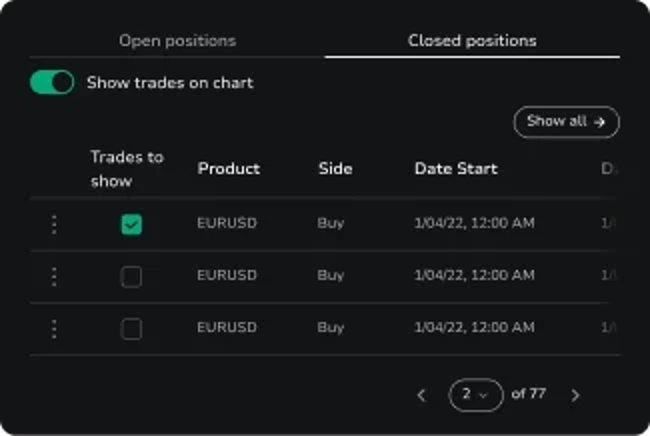
Supporting body cells · 16 / 15px · existing table layout| Session | Trades | Win rate | Expectancy |
|---|---|---|---|
| London | 42 | 57% | +0.31R |
| New York | 38 | 53% | +0.24R |
| Asia | 29 | 48% | +0.08R |
Proposal review · independent decisions
These route-scoped candidates are not approved, do not change any global token, and do not authorize migration. Inspect the working examples on the visual treatments test page.
Proposed visual treatments
Open the isolated visual testStatus: proposed, not approved · independent entry
A clipped neutral-50 diagonal fill for display-xl and display-lg only.
linear-gradient(to right bottom, var(--fxr-primitive-color-neutral-50) 30%, neutral-50 at 50% alpha); background-clip: text; -webkit-text-fill-color: transparent; solid fallback --fxr-primitive-color-neutral-50 (#F6F6F6). Lato 400. Display-xl tracking -0.01em; display-lg -0.05em.text-metallic H1/H2 fill if both target one heading. No global change in this test.gray-050 does not exist; neutral-50 is the named Product match.Status: proposed, not approved · independent entry
A three-card content treatment on the existing secondary card surface, without borders or drop shadows.
--fxr-color-bg-card-secondary solid surface; border none; no rim or gradient; --fxr-radius-lg (16px); padding --fxr-space-6 --fxr-space-8 (24px 32px); box-shadow none. The three 28px outline icons, titles, and body text use flat --fxr-primitive-color-neutral-50.--fxr-color-bg-card; no lift or shadow.fxr-ds-card surface. Its 24px 32px padding differs from the default and feature card variants. Existing interactive cards use a white/12 border and a raised-surface hover, so do not apply this treatment to them without separate review.Status: proposed, not approved · independent entry
A section surface dissolves over its final 40%; a separately switchable white top glow adds restrained atmosphere.
--fxr-color-bg-surface 0% to 60%, transparent at 100%, over --fxr-color-bg-canvas. Independent glow: radial-gradient(70% 80% at 50% 0%, --fxr-primitive-color-white at 6% 0%, transparent 70%). The glow stays at exactly 6%.--fxr-color-bg-surface. Glow off: no overlay. If gradients are unsupported, the section keeps the solid semantic surface.Status: proposed, not approved · independent entry
All seven desktop heading sizes hold from 768px upward; the size change happens only below 768px.
--fxr-type-display-xl 55px, --fxr-type-display-lg 48px, --fxr-type-heading-xl 40px, --fxr-type-heading-lg 32px, --fxr-type-heading-md 26px, --fxr-type-heading-sm 22px, --fxr-type-heading-xs 18px; desktop line heights/tracking except the independent display tracking proposal. Side padding --fxr-page-gutter 24px. Section vertical padding 96px on both tablet and desktop in this specimen.